| dc.description.abstract | Topic: Statistical Process Control
Context:
A slaughterhouse has initiated a program to implement quality management ideas at their production facility. Among others, this means an effort to keep all their processes “in statistical control”, i.e. any variation of “special cause” should be removed, leaving just the “common cause” variation inherent in the process. With the process in statistical control, the further challenge will be to reduce the common cause variation. The training program therefore included the use of control charts. The instructor had asked the participants to provide some real data from the production to illustrate the method.
The class decided to focus on the production of minced meat, sold in packages of 450 gram each. At the final stage of production the meat farce is pushed into a plastic tube, named by the locals as “catgut”, and then cut and sealed at appropriate lengths calibrated according to weight. However, even if the process is calibrated to 450 gram, there will typically be some random variation, which is predictable within limits. The consumers may react unfavourably if bought packages weigh less than 450 gram. This risk may of course be reduced by a setting slightly above 450 gram. Besides this “common cause” random variation, there may be variation of special causes, say failure of the machinery in the process of pushing, weighing, cutting and sealing. Such failures are not predictable, and if they occur, the process is not in statistical control. This is of course very risky, and if nothing is done to bring the process under control, the consumer can get surprises. The producer can of course make additional checks at the end of the line, but this adds to the costs, and is contrary to modern ideas of quality management.
A process can run out of control in different ways: You can get single deviant packages, or a stream of deviants more like a level shift. Even if the level of the process remains the same, you can have increased variation about this level. You can have permanent, but constant shift in level and variation, and you can have a situation that gets steadily worse. Control charts are usually designed as a time plot, with a horizontal level line and parallel control lines set at +/- 3 times the standard deviation of the variable plotted. Different control charts for variables are available, the simplest one is the individual X-chart. Suppose we know that the process is calibrated correctly at 450 gram, and that the standard deviation around this level is 3 gram. If the distribution of package weights are normal, the weight of an individual package is 99.7% certain to be within +/- 3 standard deviations from 450, i.e. within the interval [441, 459]. In the graphs below we illustrate X-charts for a process in control set at level 450 gram with a standard deviation of 3 gram (based on experience). The two charts illustrate two scenarios for further observation of the process, the first illustrate a process that remains in control throughout the period observed. The process would be declared out of control if a single observation falls outside the control limits LCL and UCL, as the chance of this to happen for a process in control is just 0.3%. Out of control is declared also if certain unlikely patterns occur within the control limits. The second graph illustrates a process that went out of control about observation 24, experiencing a permanent downward shift of about two. However, this does not become definite before observation 32, where we have had 9 observations in a row below the centerline. The chance that this should happen for a process in control is about 0.3%, i.e. about the same as an individual observation goes outside the 3-sigma limits. Various other decision rules exist for meaningful but just as unlikely pattern, and is implemented in software.
Control limits are computed based on a sufficiently long stretch of data for a process in statistical control. If computed for a process out of control, the limits typically get too wide, leaving out of control points erroneously inside the limits. The process should therefore ideally be brought to the state of statistical control before computing control limits. Another possibility is to remove obvious out of control point before computing limits. However, this is somewhat arbitrary, and should only be done at an initial project stage, where we have not found and removed the causes of any special cause variation in the process. This was the situation in the current project.
For mass production it is practical to sample in groups instead of a single observation, typically five consecutive items from the production line, repeated at a suitable time lag, say every hour. This gives the opportunity to uncover both level shift and increased variation at an earlier stage than using just a single observation. With group sampling the plotting point is the average of the five observations, and the control chart is then named Xbar chart. This takes care of monitoring the level of the process. In addition it is useful to monitor the local variation by computing the group range R, i.e. the difference between the largest and the smallest observation, and plot this in a separate chart named R-chart. It may also be useful to look at both charts in tandem. There is no need here to give details on how control limits are computed for these charts, as it is inherent in the software and its help functions and easily obtained from search on the Net.
With this theoretical background the class asked the production manger to provide five consecutive packages from the process once every hour. They obtained data for 32 hours of production. The data is given in the file Minced_Meat.XLS , where the groups follow consecutively as lines of 5 observations in the order of production.
Task:
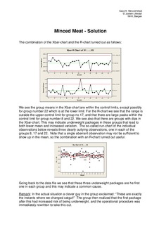
1. Plot the data in an Xbar-chart and judge if the process is in control.
2. Plot the data in an R- chart and judge if the process is in control.
3. If out of control, do you see some common features of the observations at the out of control instants than might indicate a joint special cause?
4. Establish more realistic control limits for both the Xbar-chart and the R-chart by removing or modifying the out of control observations.
Important:
Control limits are the “voice of the process” and not specification limits or tolerances (“voice of the customer”). However, a process running outside tolerances should be changed by calibration or process improvement, i.e. reducing the common cause variation (see literature on quality management). | nb_NO |